Freelance
2026
Client
Laura Whateley, Author and Journalist
Services
Brand Strategy
Brand Identity
Brief
Laura Whateley is a journalist and author covering consumer affairs, personal finance, travel, and property. Her brilliant book ‘Money; A Users Guide’ was published in 2018 by 4thestate and her new book will be coming out in 2027.
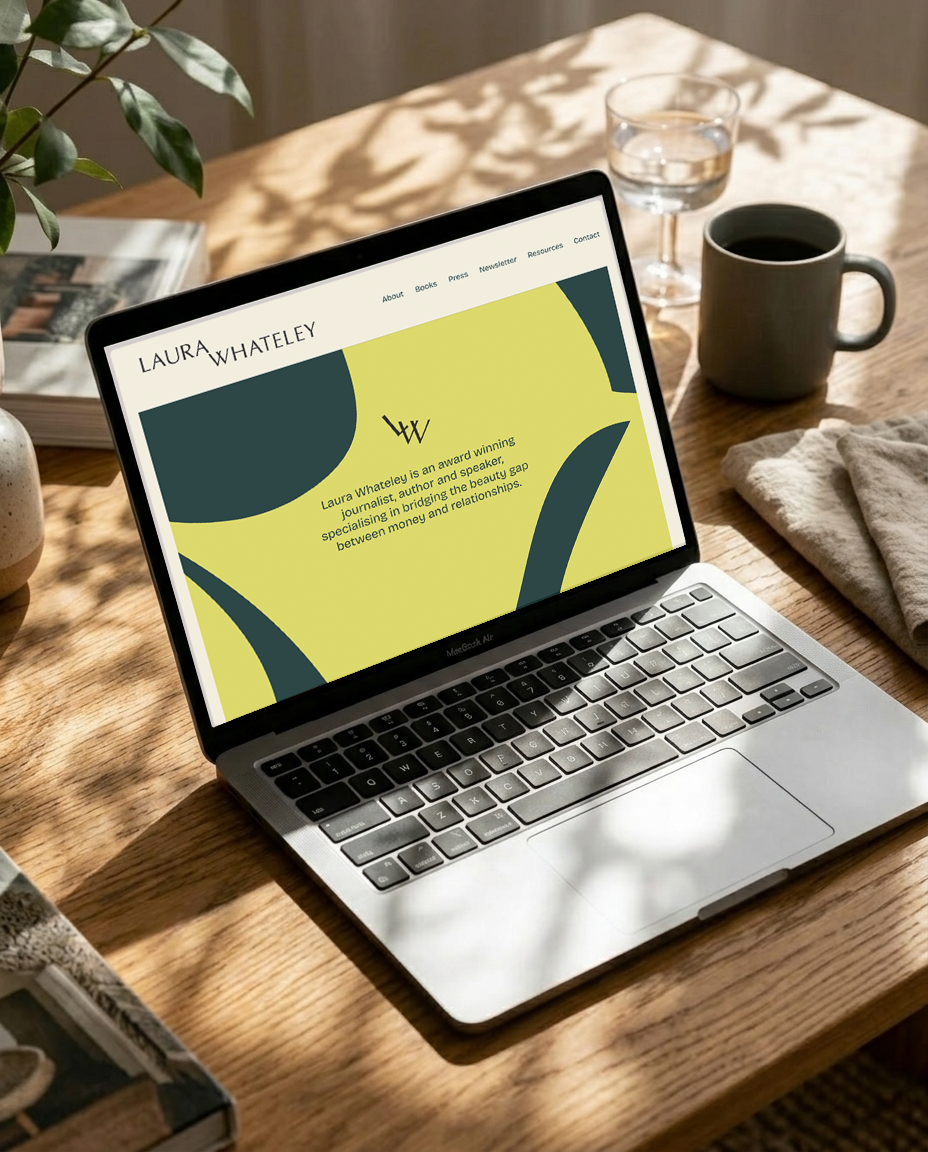
Laura got in touch as she needed a recognisable online presence and brand identity to embrace her personal brand, as well as demonstrate her unique background and perspective on money and relationships.
Laura brand identity is built around a simple but powerful discovery from the strategy process: money is never just about money. The psychology of how we spend, save and talk about finances is deeply entangled with our relationships and how we communicate with the people closest to us. This insight shaped Laura's brand theme, ‘Managing Money Together, Beautifully’ — a positioning that speaks to the emotional, human side of personal finance rather than the purely transactional.
Where much of the financial advice space leans on stock imagery and clinical, corporate visuals, Laura wanted something different: an identity that treats money with warmth rather than jargon.
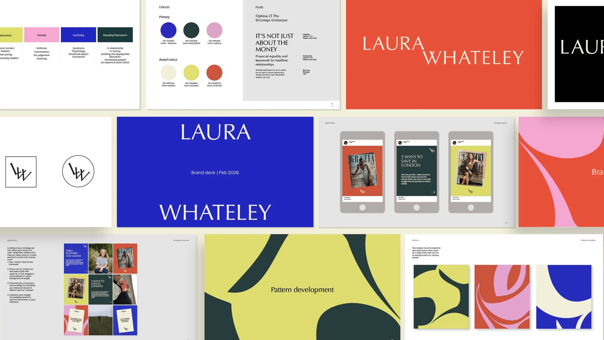
The brand takes a lifestyle approach rather than a corporate one, using bright, joyful colours to create a sense of ease and approachability, making conversations about finance feel less like a source of anxiety and more like something beautiful, shared and manageable.
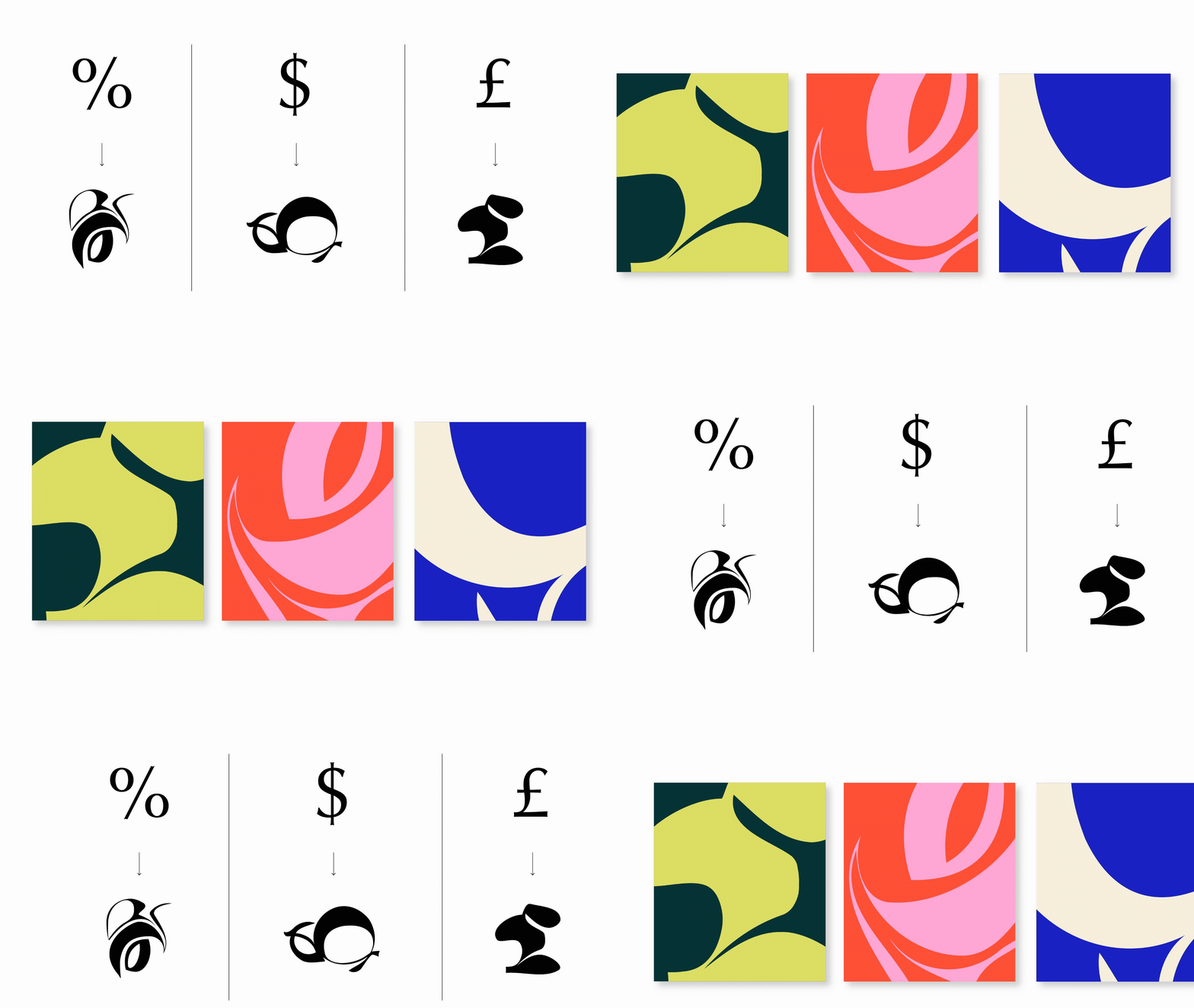
I developed Laura’s signature patterns by taking traditional symbols of money and finance such as the pound and dollar sign, and abstracting them to the point where they become objects of beauty in and of themselves.


TESTIMONIAL
“Lucy has been as much a coach and holder of my sometimes scattered ideas as talented designer, full of original, thoughtful suggestions about where to take my writing and “brand” (a word and concept I’ve always found a bit icky and shied away from but one that Lucy’s helped me to realise I can claim and feel more positive about!)
It can be isolating working on your own and I found the process of brainstorming what it is I actually do, care about and value and then want to achieve, enlightening and reassuring, reigniting some ambition and confidence that I felt I’d been lacking.
Somehow Lucy then turns all of this into a beautiful visual representation of my work. From a practical perspective having a visual identity - colours, fonts, illustrations, and someone who knows what they are doing to explain how to adapt and use them, is invaluable in a world where having an online visual brand really matters and has stopped me being so hesitant to “put myself out there” because it’s given me a structure to work to and made everything feel and look more coherent and professional. And because Lucy is so creative it sets my branding apart from the AI/ canva templates that many people rely on.
The whole process of working with Lucy has been so supportive, as well as extremely fun and inspiring. “
— Laura Whateley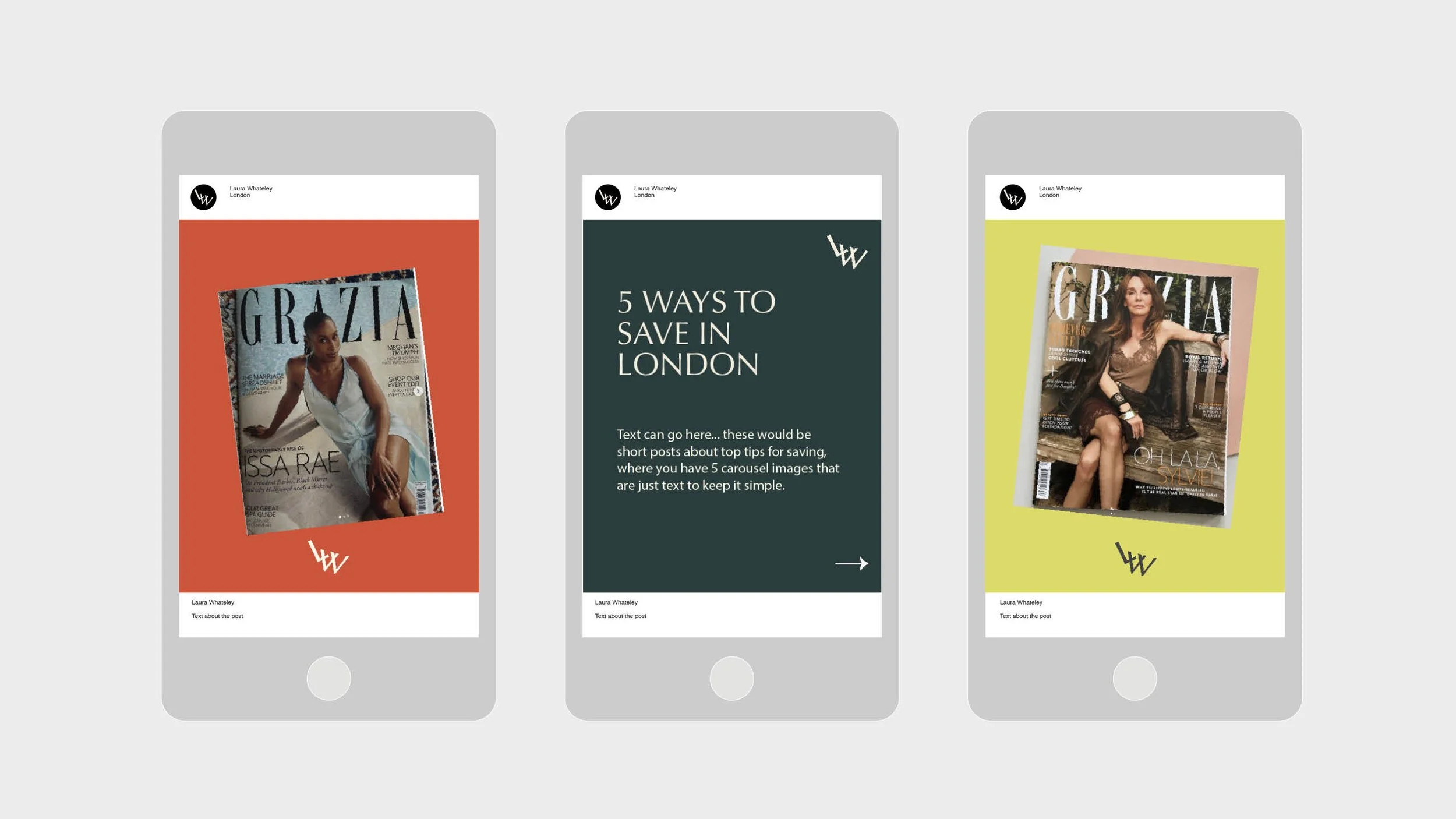
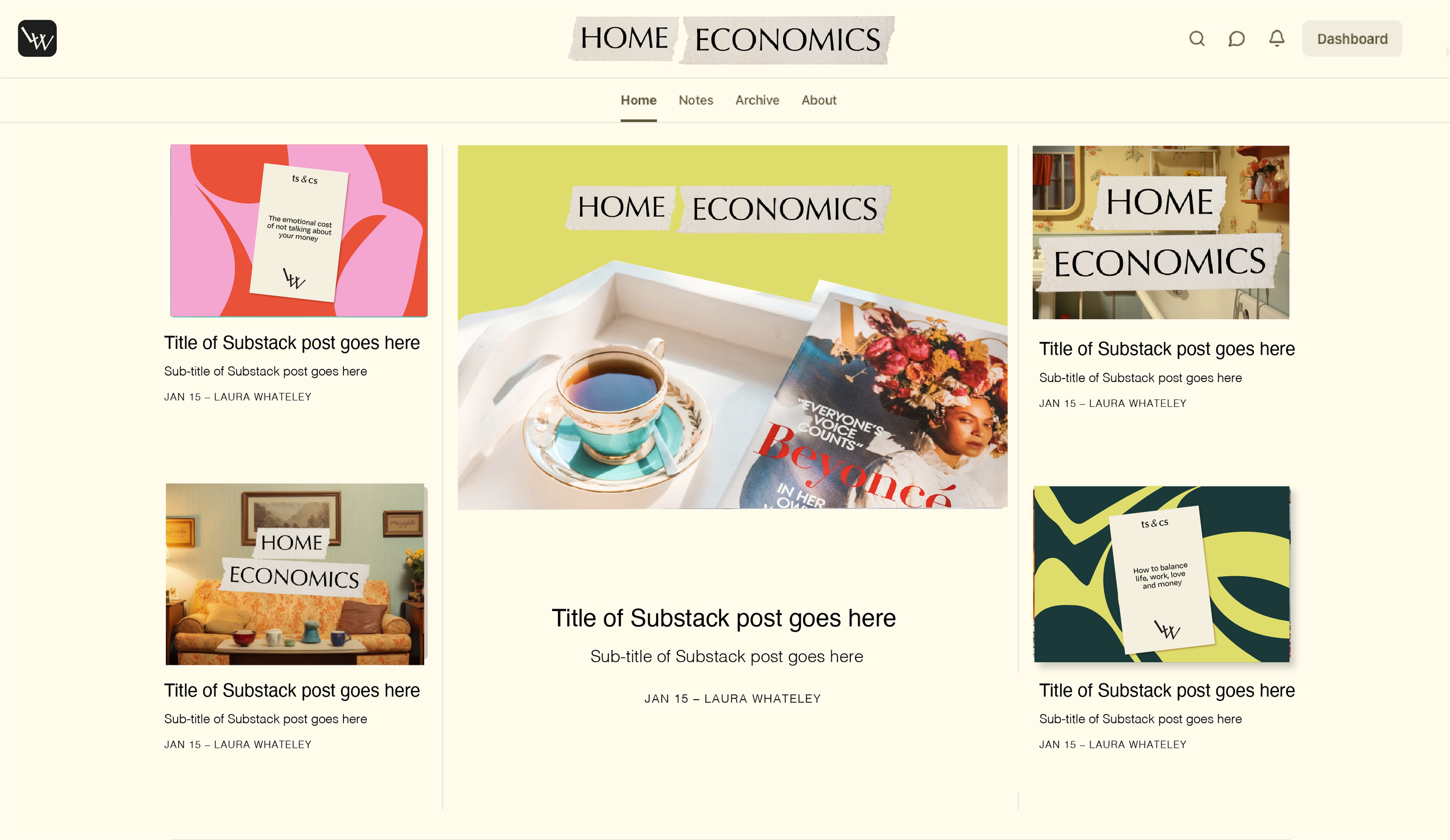
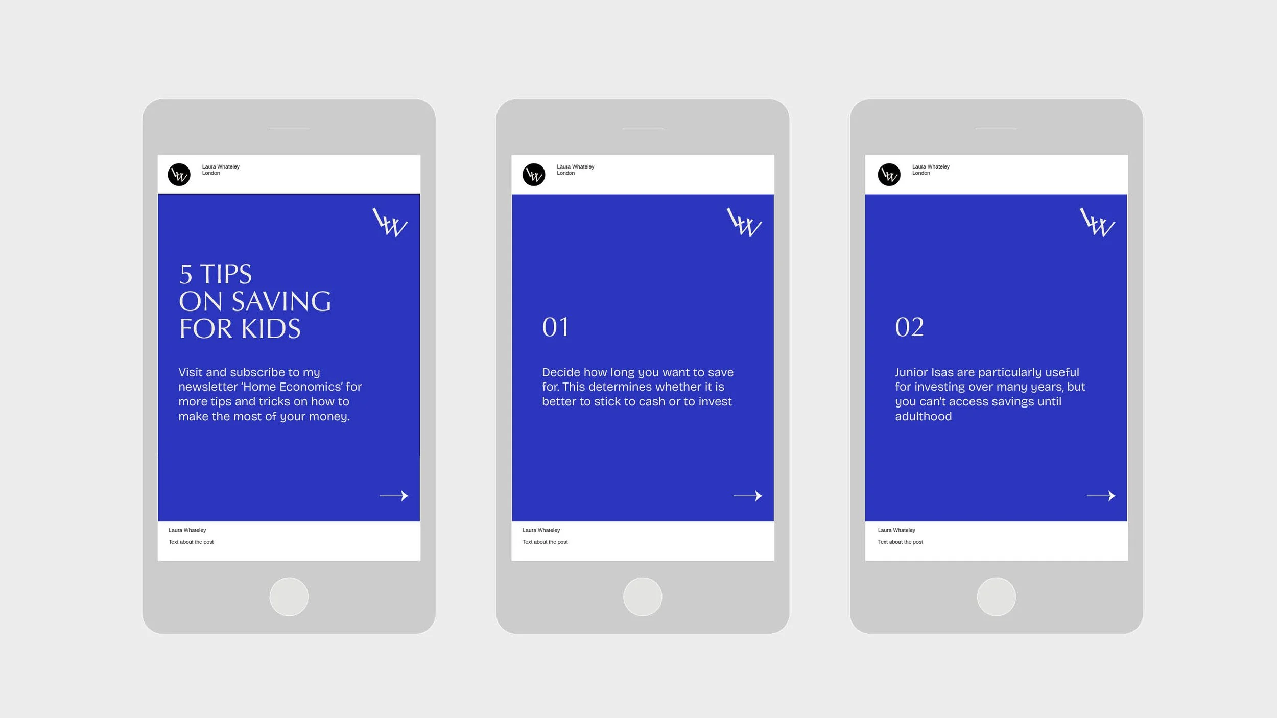
Alongside her overall brand identity, Laura wanted to launch her Substack post under the sub-brand Home Economics. I developed templates for her to create accompanying visuals for her Substack posts in line with the overall look and feel of her new brand identity, adding in a hand-rendered touch to emphasise the human-centred approach to financial topics.